5 Neutral Paint Colors That Work Every Time
Neutral paint colors should be so simple, right?! After all, white is white. OK. All kidding aside, there are literally hundreds of whites and thousands of neutral paint colors out there, and it can make your head spin to choose the right one. I have 5 go-to neutral paints that work for me EVERY time and I'm going to let you in on the secret now!
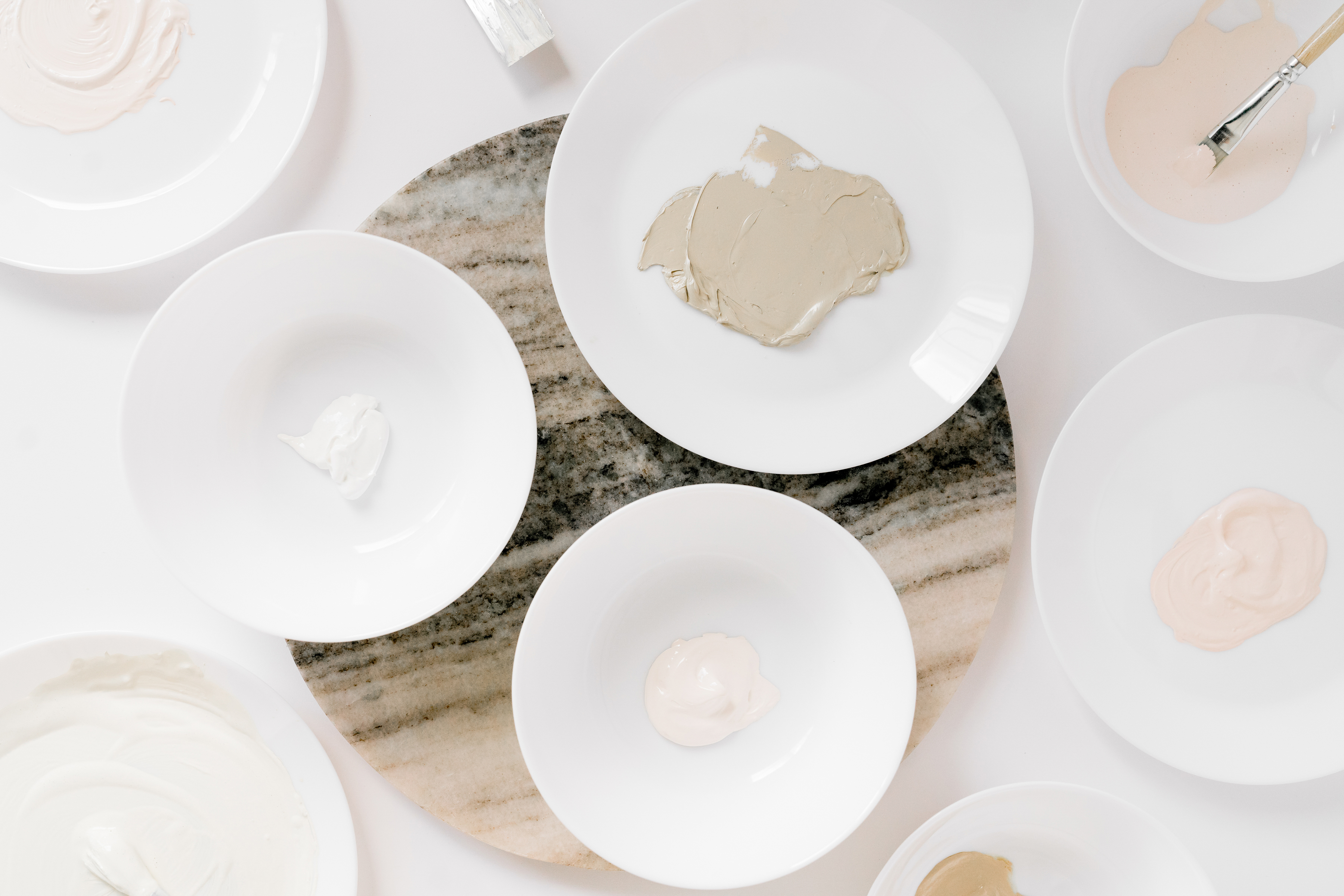
1. Benjamin Moore's White Dove

This is a favorite paint color among interior designers for a reason! As we know, having the right undertones is the key to the perfect white. If it's too yellow, it could clash with flooring. Too green, and it might be gray-ish in afternoon light. White Dove has just a little bit of yellow as an undertone, but that just makes it creamy and slightly warm. This white works in almost every situation!
2. Farrow & Ball Blackened

If you want something that's more of a traditional ivory, then this is the neutral for you! If you aren't familiar with this color, the name Blackened might throw you for a curve. But Farrow & Ball says it named the color that because it's historically made by adding lamp black pigment gathered from the smoke of burning oil lamps. And it is a classically traditional cool ivory that I love!
3. Sherwin-Williams Passive

A great classic, calm, and elegant neutral is Passive. It is a light gray that pairs so well with a crisp white and well, almost any color! Passive also has enough depth to look really great in shadows, which helps when you look at the colors in morning and evening light!
4. C2 Mortar

If you're going for a great paler shade of taupe that works in almost any room, then Mortar is the one for you! This is a cozy hue that adds the perfect amount of warmth without going too yellow. C2 also creates paints that are made of finely ground artisan-grade pigments, and their sample cards are way bigger than what you normally get from a paint company!
5. Benjamin Moore Revere Pewter

Want a warm neutral? Revere Pewter is a bit of gray, a bit of beige, and a whole lot of gorgeous! It has warm undertones works really well in an open floor plan- making the space open and cozy at the same time.
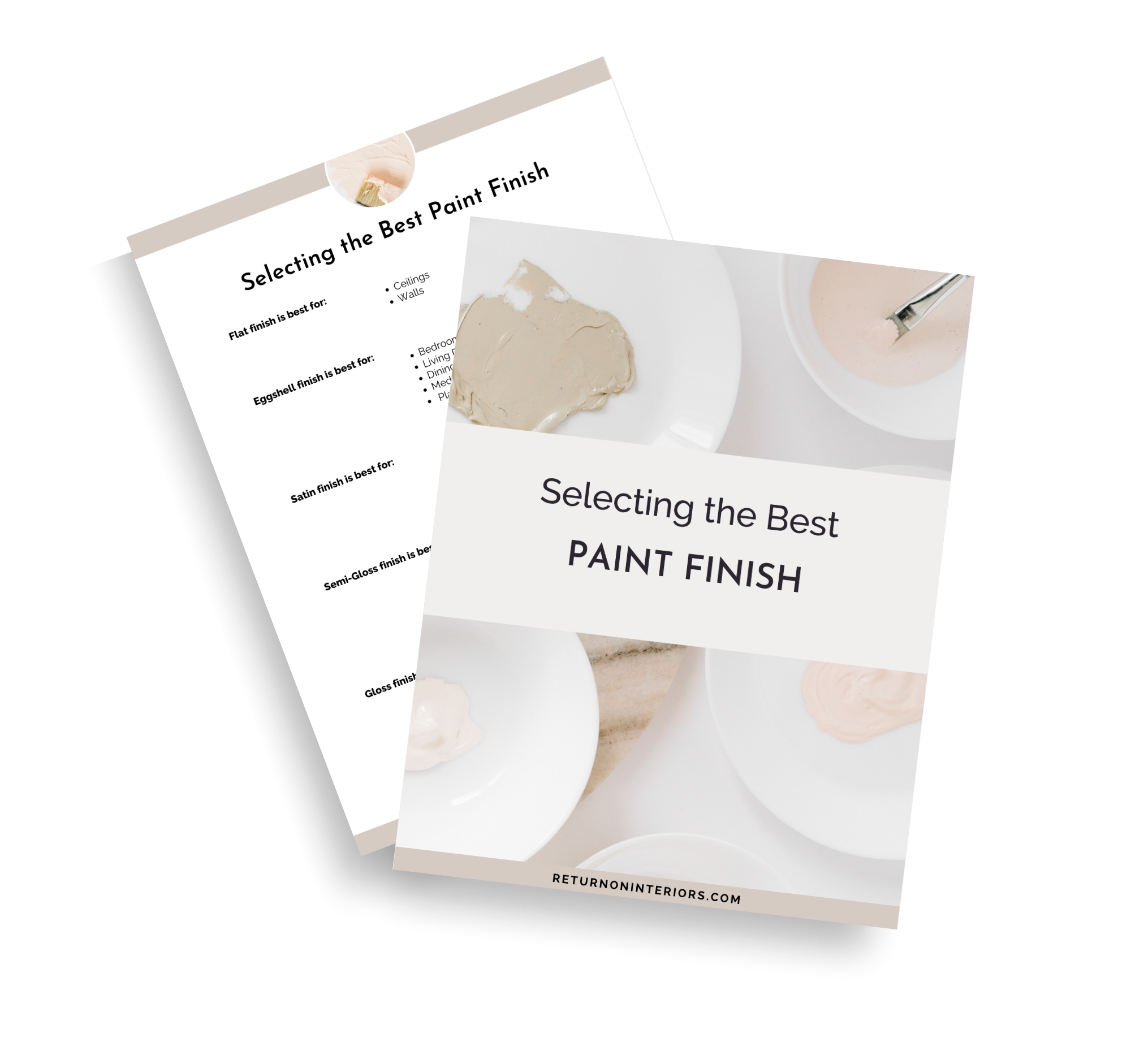
There's so much to consider when you're choosing paints, and color isn't the only top priority. Once you find the right shade you have to then decide if you're going with a flat, eggshell, satin, semi-gloss, or high-gloss finish. But I'm going to take even MORE guesswork out of this for you. Just click here to get my FREE Guide to Selecting the Best Paint Finish!

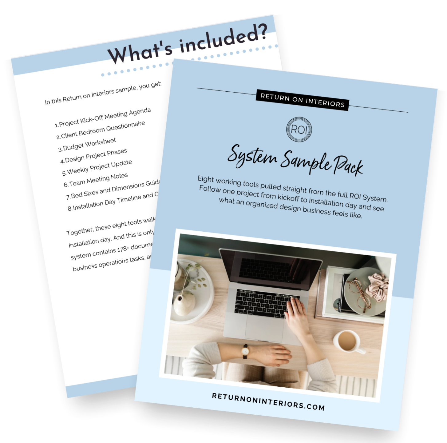
Get the Free Sample Pack
Eight tools built to make sure nothing gets lost between you, your client, and your trades.
Quick answers without the googling
49 Quick Reference Guides for interior designers. Visual, printable, and ready to use.